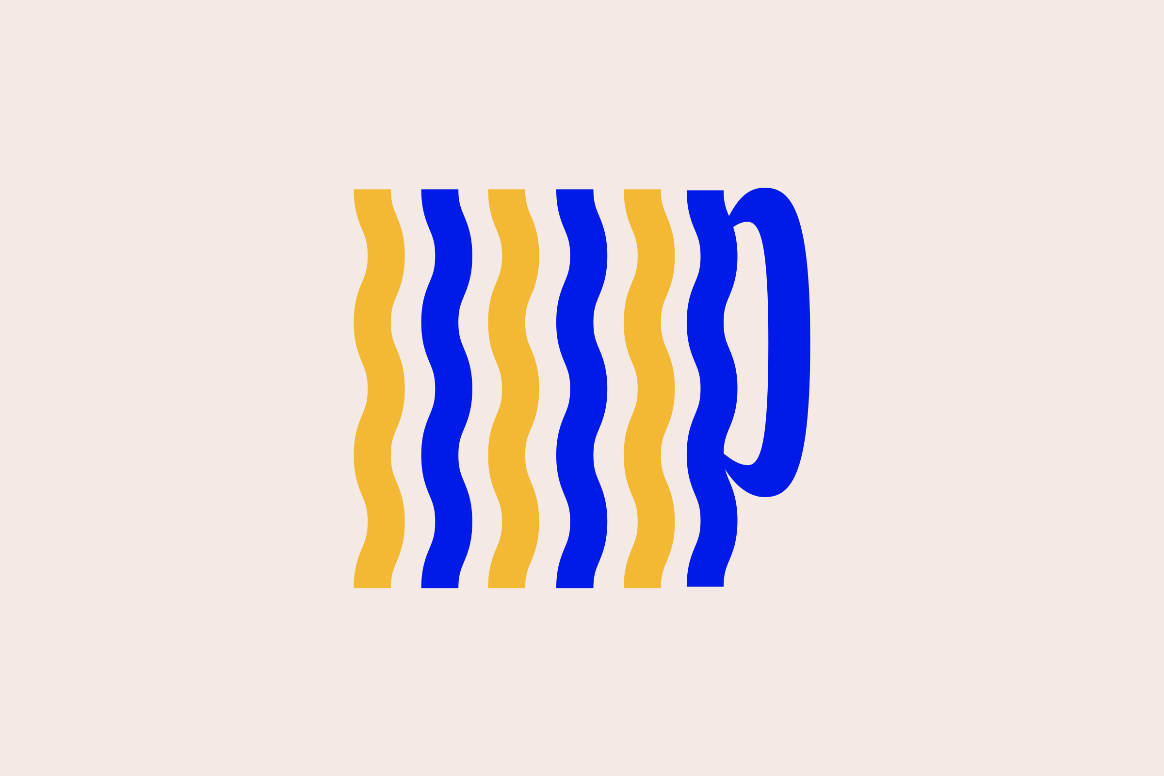
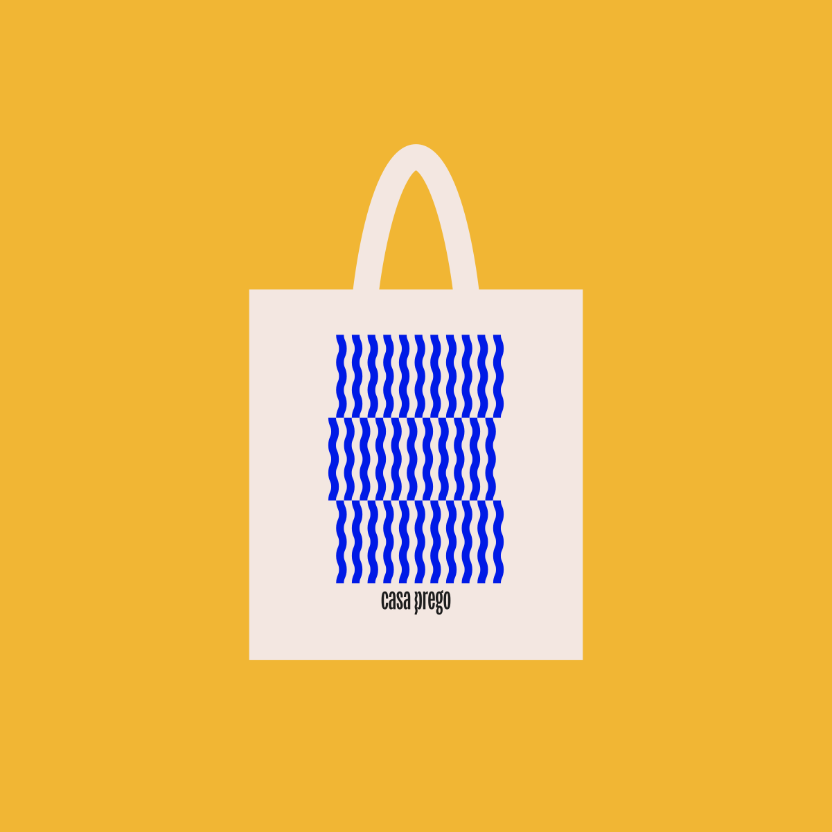
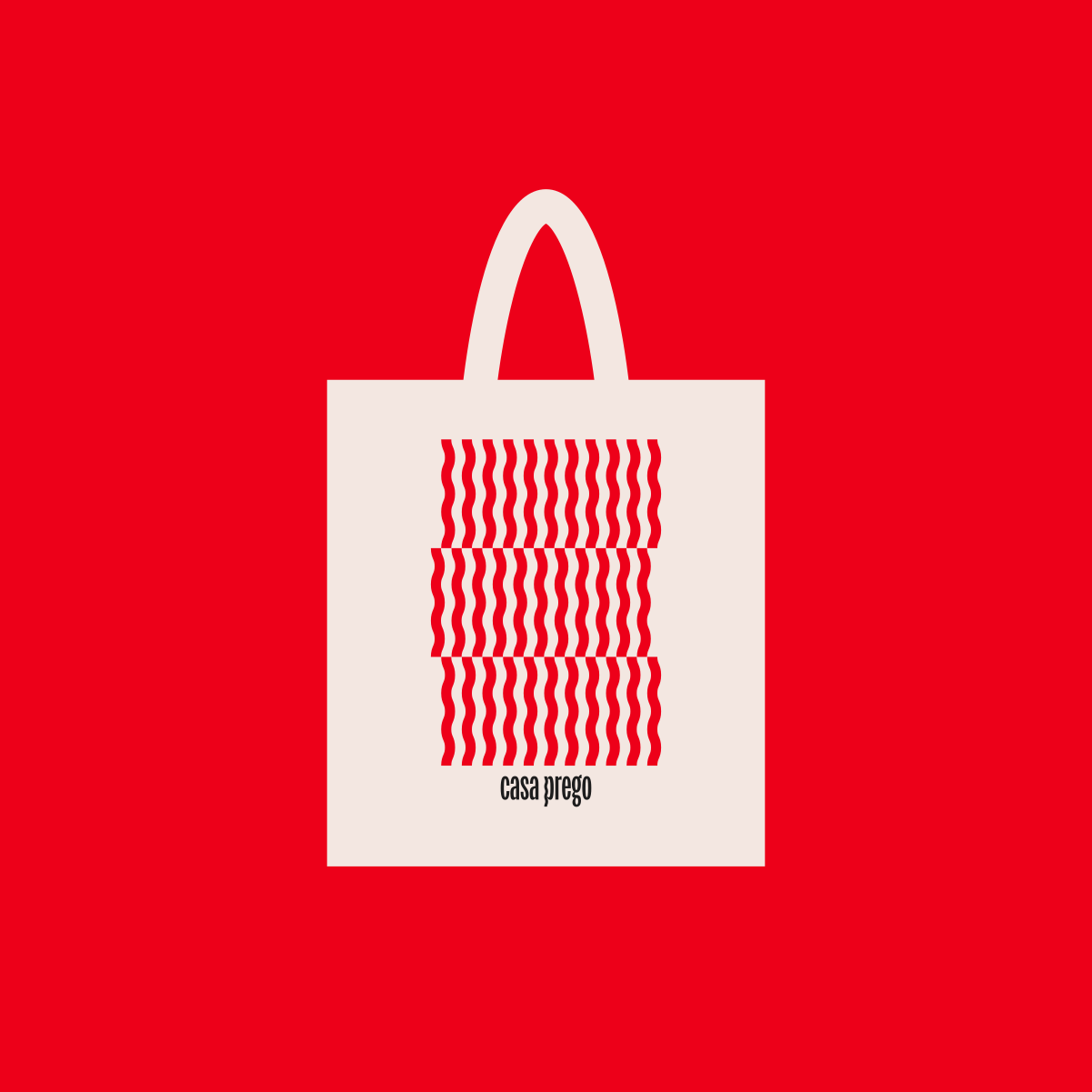
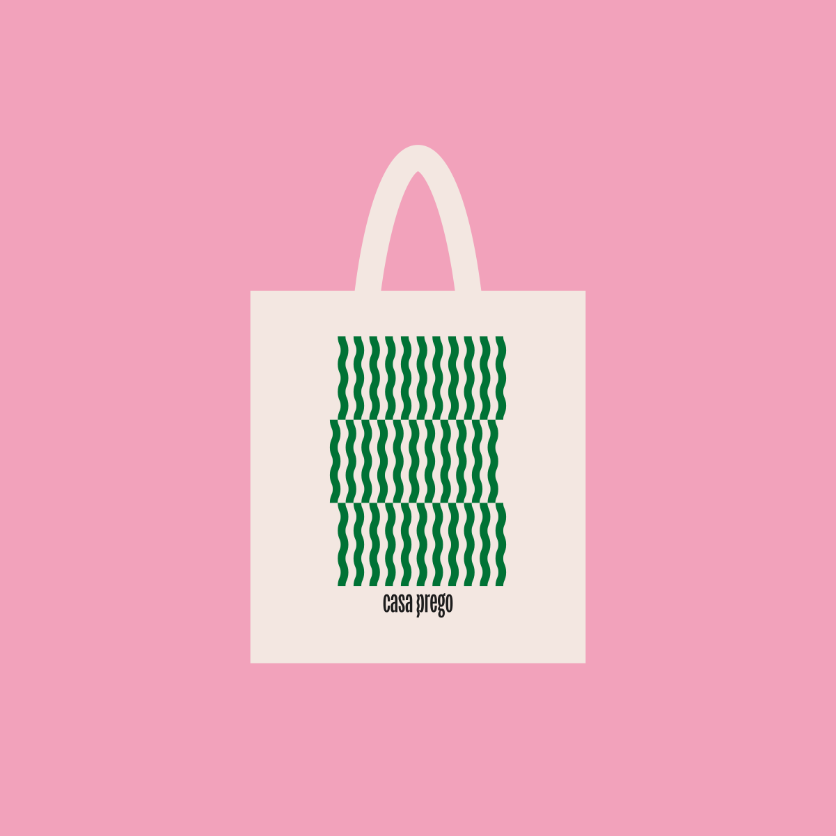
The visual identity was built around a playful interpretation of the word “prego”, which means “nail” in Portuguese. A simple and almost invisible element, the nail allows people to personalize their homes by hanging artworks, images and objects on their walls. This idea inspired the custom treatment of the letter “P”, shaped as a bent nail marked by the impact of being hammered. The imperfect form became the foundation of the identity, later expanding into a graphic pattern used throughout the brand system.